Welcome to Techstarz Hub
Why Bootstrap is Great for Responsive Web Design
What is Bootstrap?
Bootstrap is a free framework for building websites. It has pre-written HTML, CSS, and JavaScript. This makes it easier and faster to create responsive websites. A responsive website looks good on desktops, tablets, and mobile phones.
Why Use Bootstrap?
Easy to Use
Bootstrap is easy to learn and use. Even beginners can start creating websites quickly. You don’t need to write all the code from scratch.
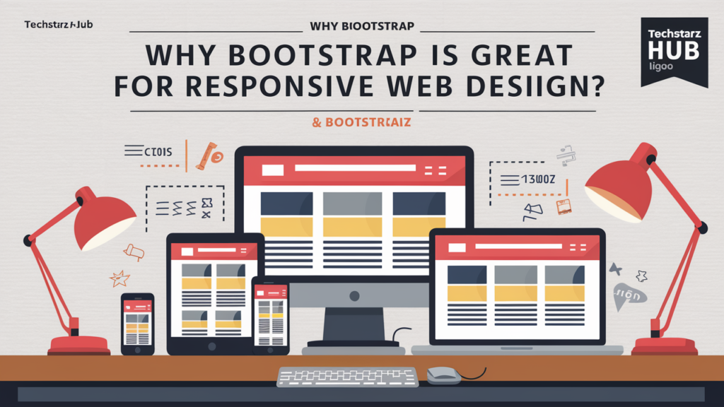
Responsive Design
Bootstrap has a grid system. This system helps you arrange your content in columns. The columns adjust themselves based on the screen size. This means your website will look great on any device.
Pre-designed Components
Bootstrap comes with many pre-designed components like buttons, forms, and navigation bars. You can use these components to make your website look professional without much effort.
Customizable
You can customize Bootstrap to match your website’s design. You can change colors, fonts, and other styles to fit your brand.
Community Support
Bootstrap has a large community. If you have any questions or face any issues, you can easily find help online.
Example: Creating a Responsive Page with Bootstrap
Here is a simple example of a responsive webpage using Bootstrap:
<!DOCTYPE html>
<html lang="en">
<head>
<meta charset="UTF-8">
<meta name="viewport" content="width=device-width, initial-scale=1.0">
<title>Responsive Web Design with Bootstrap</title>
</head>
<body>
<header class="bg-primary text-white text-center py-5">
<h1>Welcome to Techstarz Hub</h1>
</header>
<div class="container my-5">
<div class="row">
<div class="col-md-4">
<h2>Easy to Use</h2>
<p>Bootstrap is easy to learn and use, making web development faster and more efficient.</p>
</div>
<div class="col-md-4">
<h2>Responsive Design</h2>
<p>With Bootstrap's grid system, your website will look great on any device.</p>
</div>
<div class="col-md-4">
<h2>Customizable</h2>
<p>Customize Bootstrap to match your website's design and branding needs.</p>
</div>
</div>
</div>
<footer class="bg-dark text-white text-center py-3">
<p>© 2024 Techstarz Hub. All rights reserved.</p>
</footer>
</body>
</html>
Conclusion
Bootstrap is an excellent css framework for creating responsive websites quickly and easily. At Techstarz Hub, we use Bootstrap to ensure that our websites look great on all devices. Whether you are a beginner or an experienced developer, Bootstrap can help you create beautiful and responsive websites.
If you want to learn more about our web development services or need help with your project, feel free to contact us.