The Importance of Responsive Web Design in 2024
Ensuring your website adapts to all devices is crucial for success.
What is Responsive Web Design?
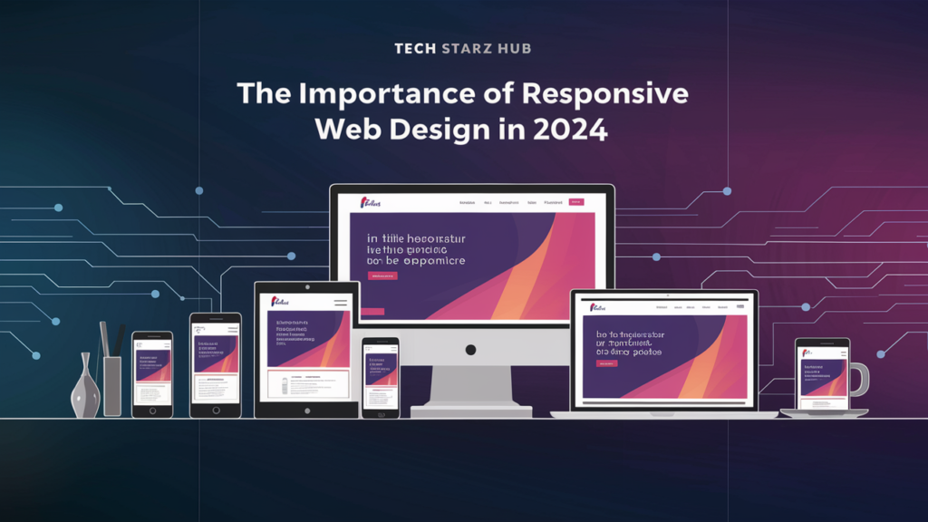
Responsive web design refers to a design approach that allows a website to adapt to the screen size and orientation of the device being used to view it. Whether it’s a desktop, tablet, or smartphone, a responsive website ensures that the content is displayed correctly and is easy to navigate. This flexibility enhances the user experience and helps retain visitors on your site.
Why is Responsive Design Essential?
- Improved User Experience: Users expect a seamless experience when browsing websites. A well-designed responsive website keeps users engaged and encourages them to explore more of your content.
- Higher Search Engine Rankings: Google prioritizes mobile-friendly websites, meaning a responsive design can significantly improve your site’s visibility in search results.
- Increased Mobile Traffic: A responsive website ensures that mobile users have a smooth experience, leading to higher engagement and conversions.
- Cost-Effective Maintenance: A responsive website eliminates the need for multiple versions, making it easier and more cost-effective to manage and update your site.
- Faster Page Load Times: Responsive websites often have faster load times on mobile devices, which is crucial for user retention.
- Adaptability to Future Devices: A responsive design ensures that your website can adapt to future devices without requiring major updates.
How to Implement Responsive Web Design
Implementing responsive web design involves using flexible grid layouts, fluid images, and CSS media queries. These elements work together to create a site that adjusts seamlessly to different screen sizes.
Key Elements of Responsive Design:
- Fluid Grids: Use relative units like percentages to define the width of elements, allowing the layout to adapt to the size of the screen.
- Flexible Images: Images are scaled using relative units so they can resize within their containing element.
- Media Queries: CSS media queries are used to apply different styles based on the device’s characteristics, such as screen width or orientation.
Testing for Responsiveness
After implementing responsive design, it’s important to test your website on various devices to ensure it works as intended. Tools like Google’s Mobile-Friendly Test, BrowserStack, or simply resizing your browser window can help you identify any issues.
Conclusion
Responsive web design is no longer optional; it’s a necessity in today’s digital landscape. Ensuring your site is responsive will enhance the user experience, improve search engine rankings, increase mobile traffic, and future-proof your site. Investing in responsive web design is a smart and essential move for businesses looking to stay competitive and relevant.